After developing a new member experience, branch design, and a brand refresh, we were asked to develop the online digital experience for Credit Union 1. Banking websites are interesting in that they all tend to look the same and offer the same generic experience. We had designed other sites prior but had only managed to make incremental improvements. With Credit Union 1 we wanted to build a new type of experience.
CU 1 had recently shifted their print magazine to digital. The magazine was full of great content that was relevant and informative for Alaskans. CU1 was also planning a more robust email marketing initiative which would drive members to different sections of the website, which meant that each of the sections needed to function as launch pages. It also meant that we could think a bit differently about what the value of the main home page was to users.
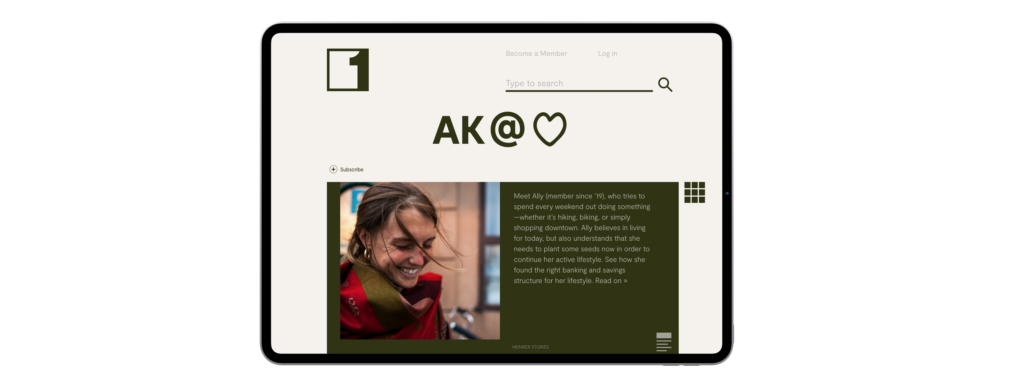
We decided to design the site more like an editorial experience than shopping for products. We lead with editorial content and used the editorial content to communicate the products and services. So rather than a page that begins with a stock image and lists the types of checking accounts, we begin with a story about a member. We tell the member story in a brief narrative and then weave in the checking account types to the story. This provides a relevancy and framework for understanding the products. For example, the story may be about Ally who is a freelance photographer. The brief narrative explains how Ally travels a lot and high expenses, potentially incurring fees for low balances. It then explains how the Free Checking product is good for her lifestyle and how she connected to a savings account as part of a savings plan and to cover any overages. We seek to use the editorial content to make tangible the product characteristics and act as a narrative tool to guide the user on which product is best for them.
To accomplish this, we needed a system that would allow the marketing team to easy connect the stories to the products and services and allow them to have a dynamic home page with changing content on each visit as one would encounter with a newspaper or magazine website.
We leverage a text-based search on all the pages for younger users who prefer this means of search, as well as a navigation system consisting of the pictograms we developed as part of the new visual identity. The square box shape, adapted from the squared one logo and derived from the way content is typically stacked vertically on mobile versions of the site, is used as the module system for all the content. The home page, and sections of all the pages consist of basic invisible grids where they can choose to have modules, or “content cubes”, and arranged in a manner that connects different pieces of content.
The back-end system would allow the marketing team to input content. This content is then reformatted into a finite range of “cubes” which can then be assembled on the site. If the team wants to promote CDs next month, they select a “featured cube” which has a featured rate, plus a member story relevant to CDs, and then maybe an image, pictogram, or video cube. These three cubes are positioned at the top of the main page and can also be positioned on the bottom of other sections/pages for a cross-sell. There is still the need for a range of page designs, but the underlying framework for the whole site is the cube grid, and every page begins and ends with content cubes. Either a series or single enlarged cube at the top, and then a series of cubes at the bottom to drive the user through other areas of the site.
See more work with CU1:
Brand Refresh
Branch Design
Service Design
Corporate Interior Fit-Out
Outposts
Drive-Up Banking
"The experience working with Design Made has been nothing short of spectacular. From the depth of research they conduct to inform their work to the professionalism of presentation materials that help inform decisions and finally to the finished product - wow! Working with Design Made has been such an exciting and inspiring experience for me and my coworkers."
— Rachel Langtry, COO Credit Union 1