Context
The cannabis market is undergoing massive expansion and seeing a proliferation of new players enter the space. Our client, Prime Harvest, has been selling cannabis since the early days. In recent years they have grown and expanded and are currently in the process of taking the company public. They approached us to help with a new initiative for a line of cannabis products under the name HICHI. They had already developed an initial identity and some early packaging ideas when they first approached us.
Approach
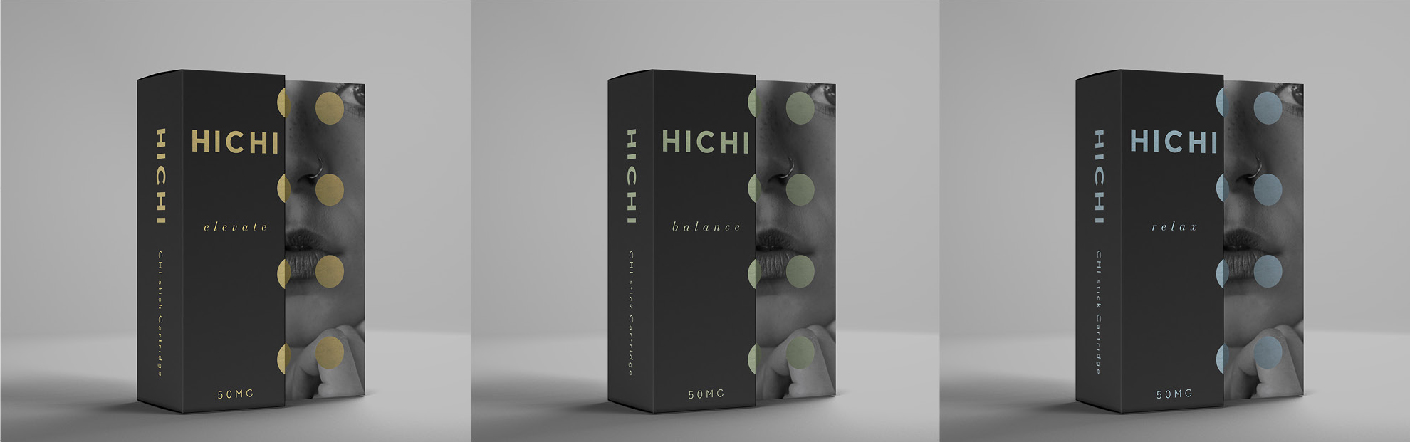
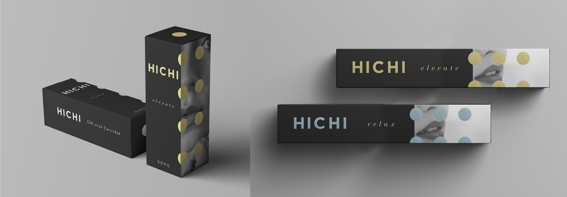
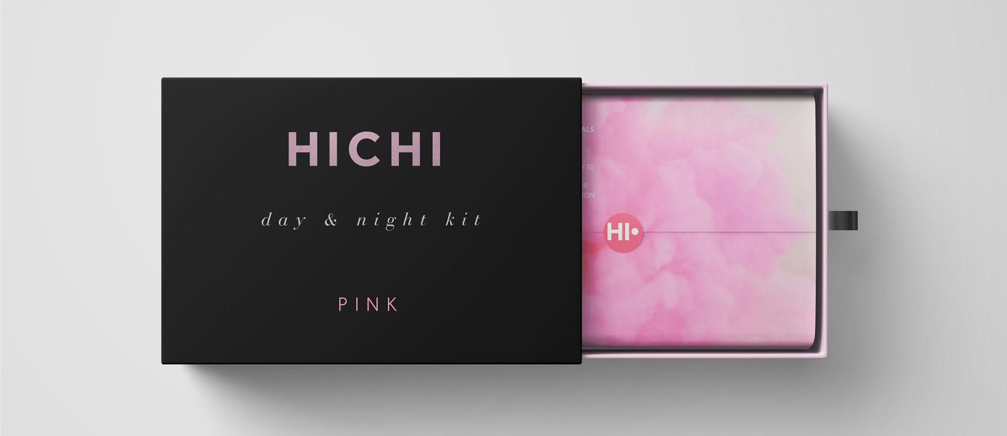
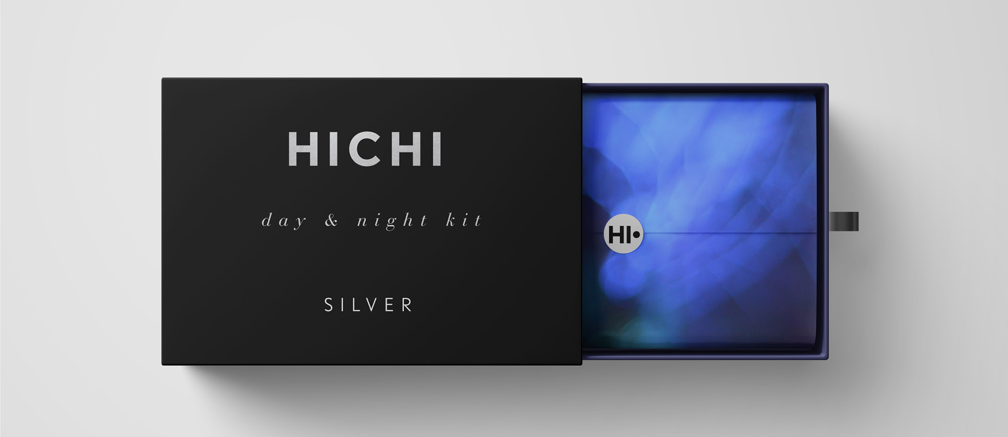
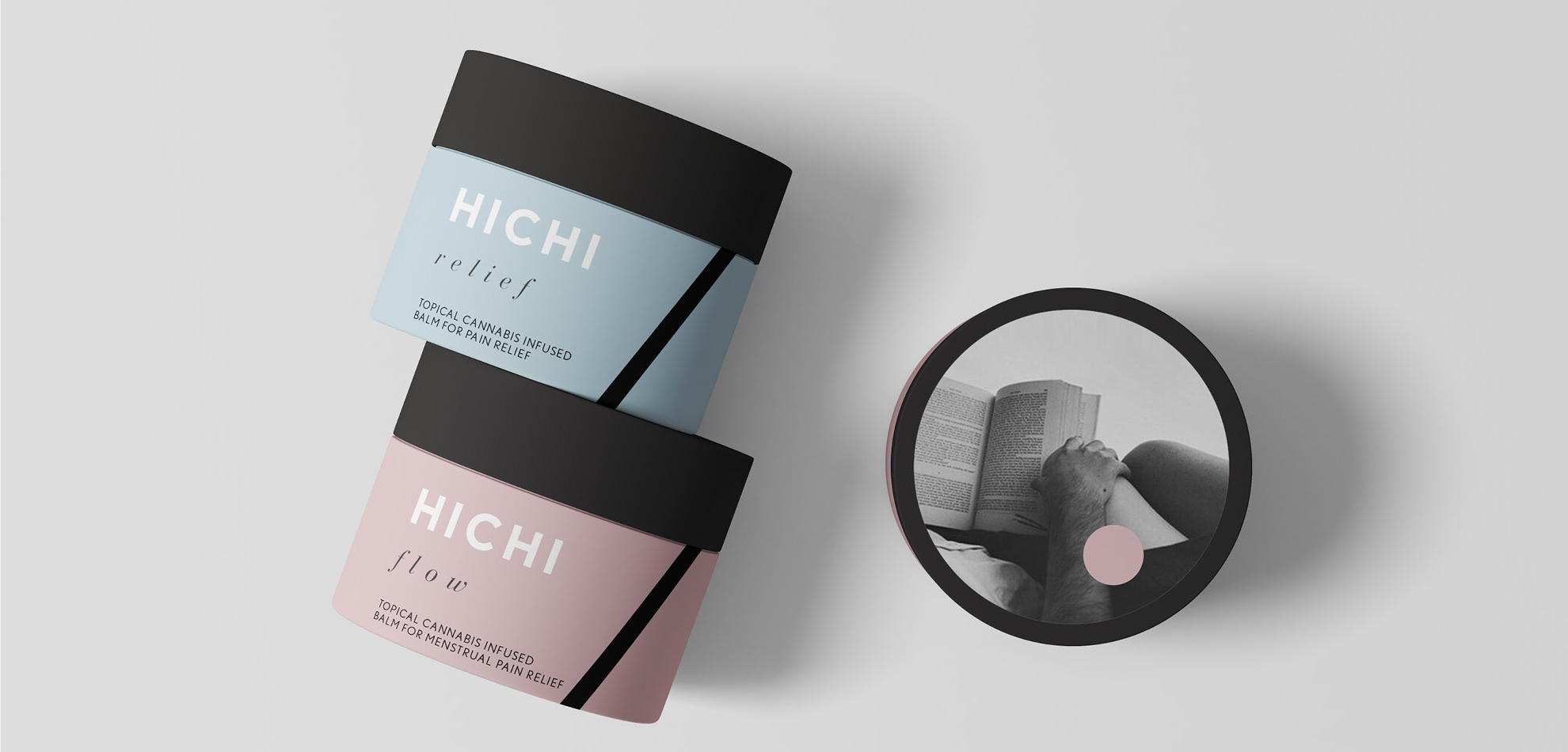
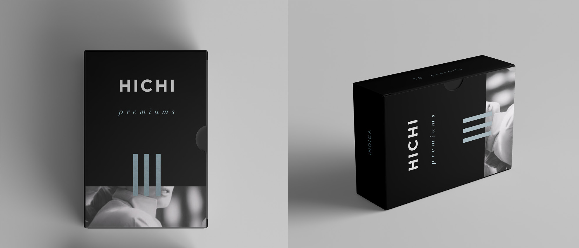
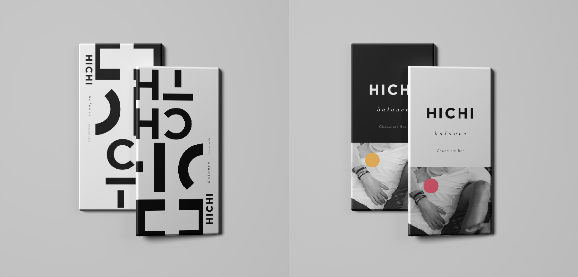
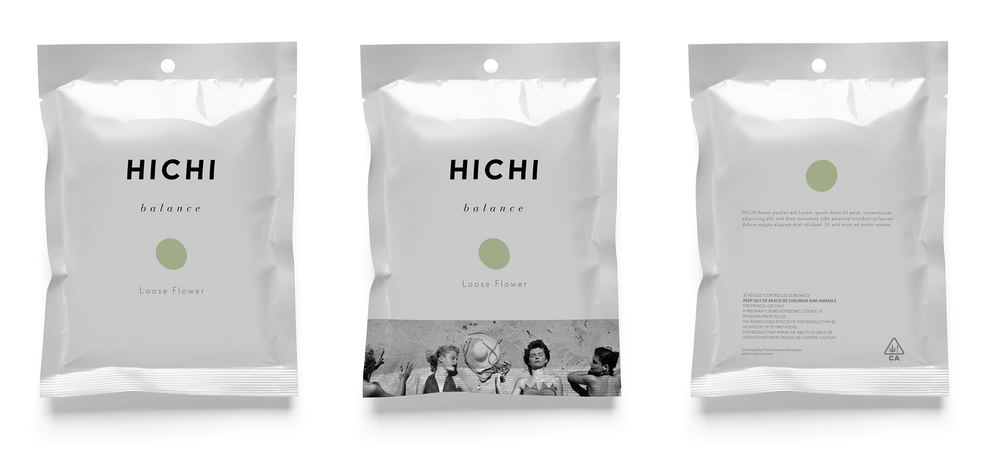
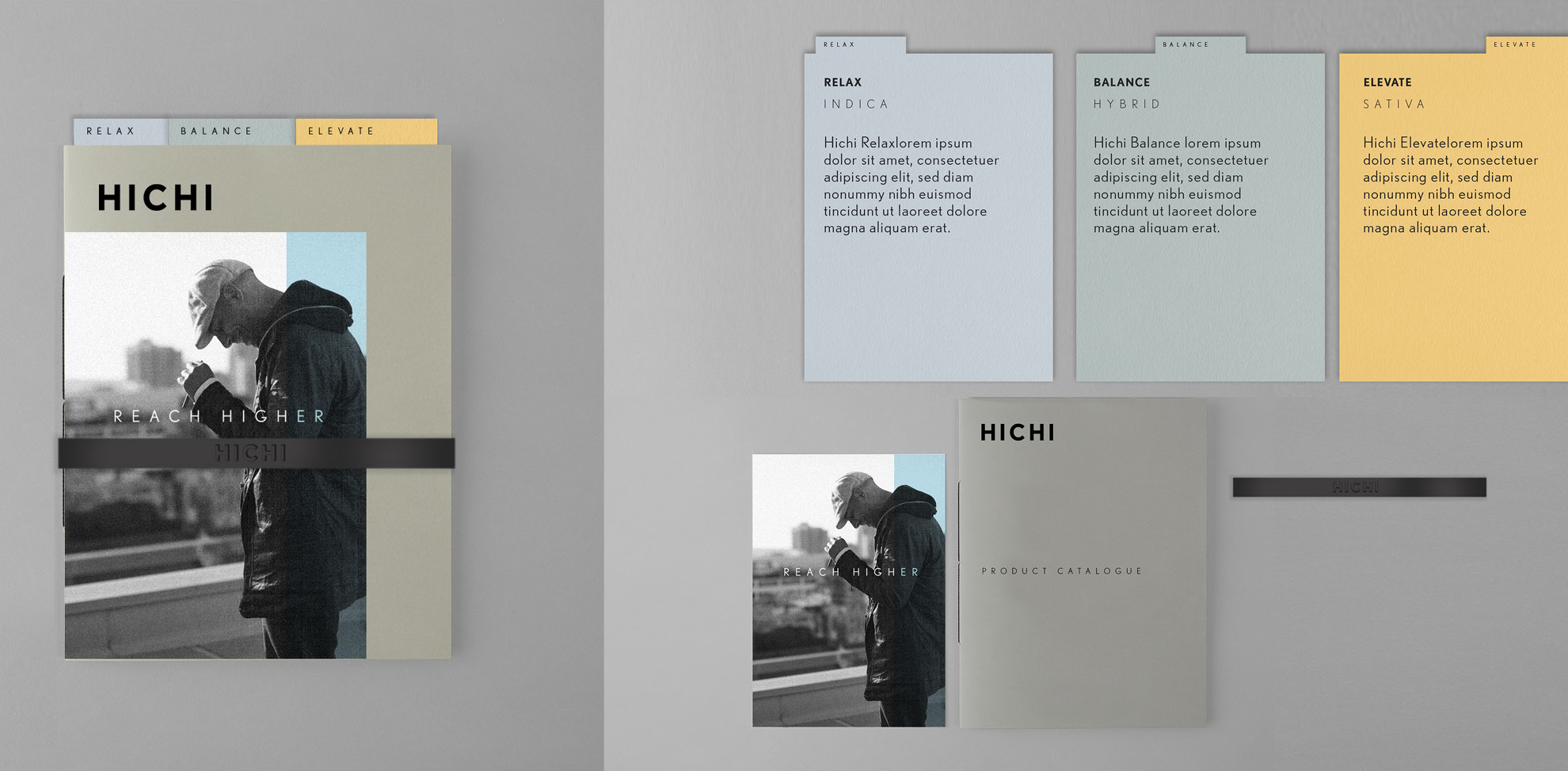
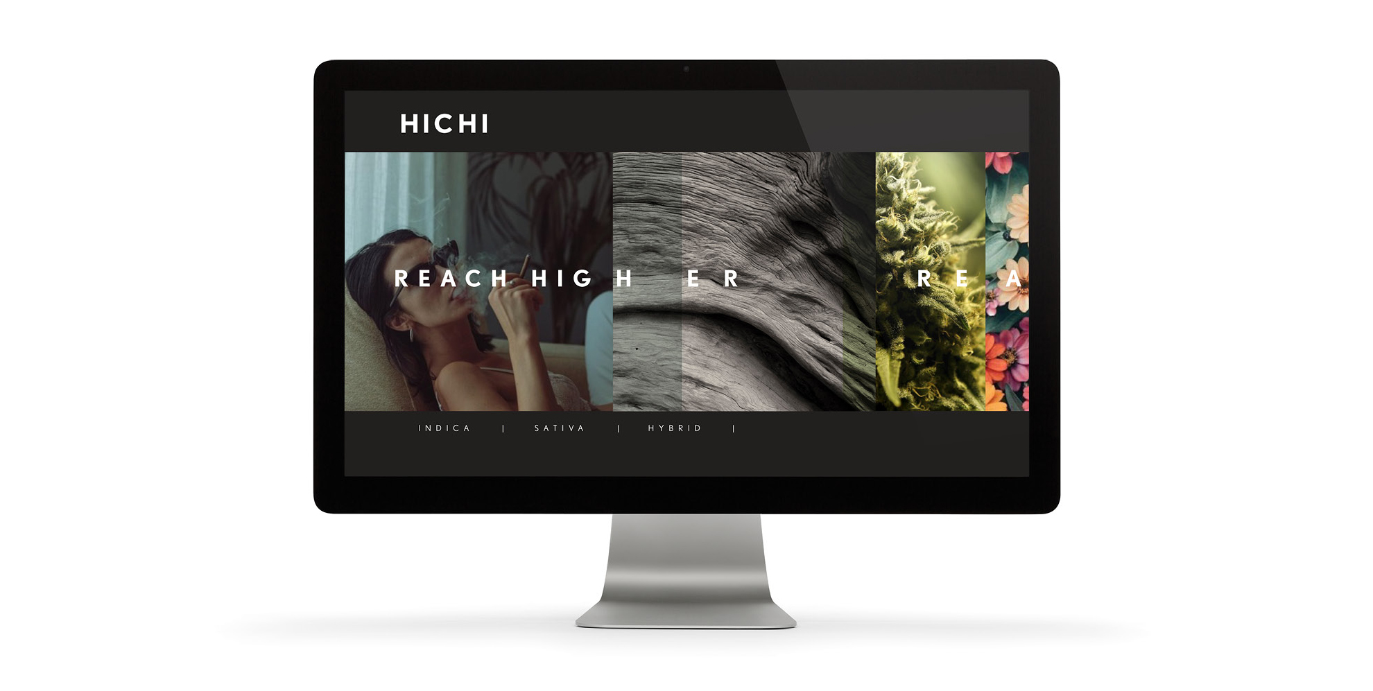
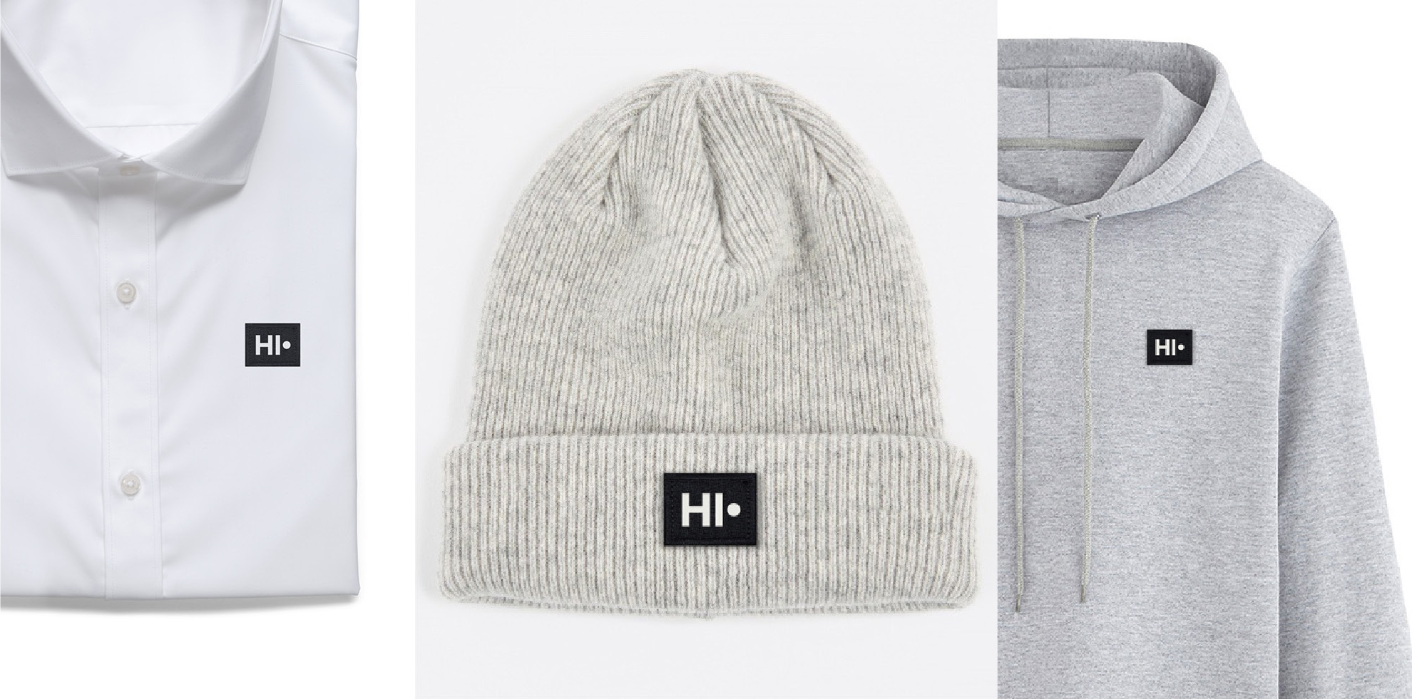
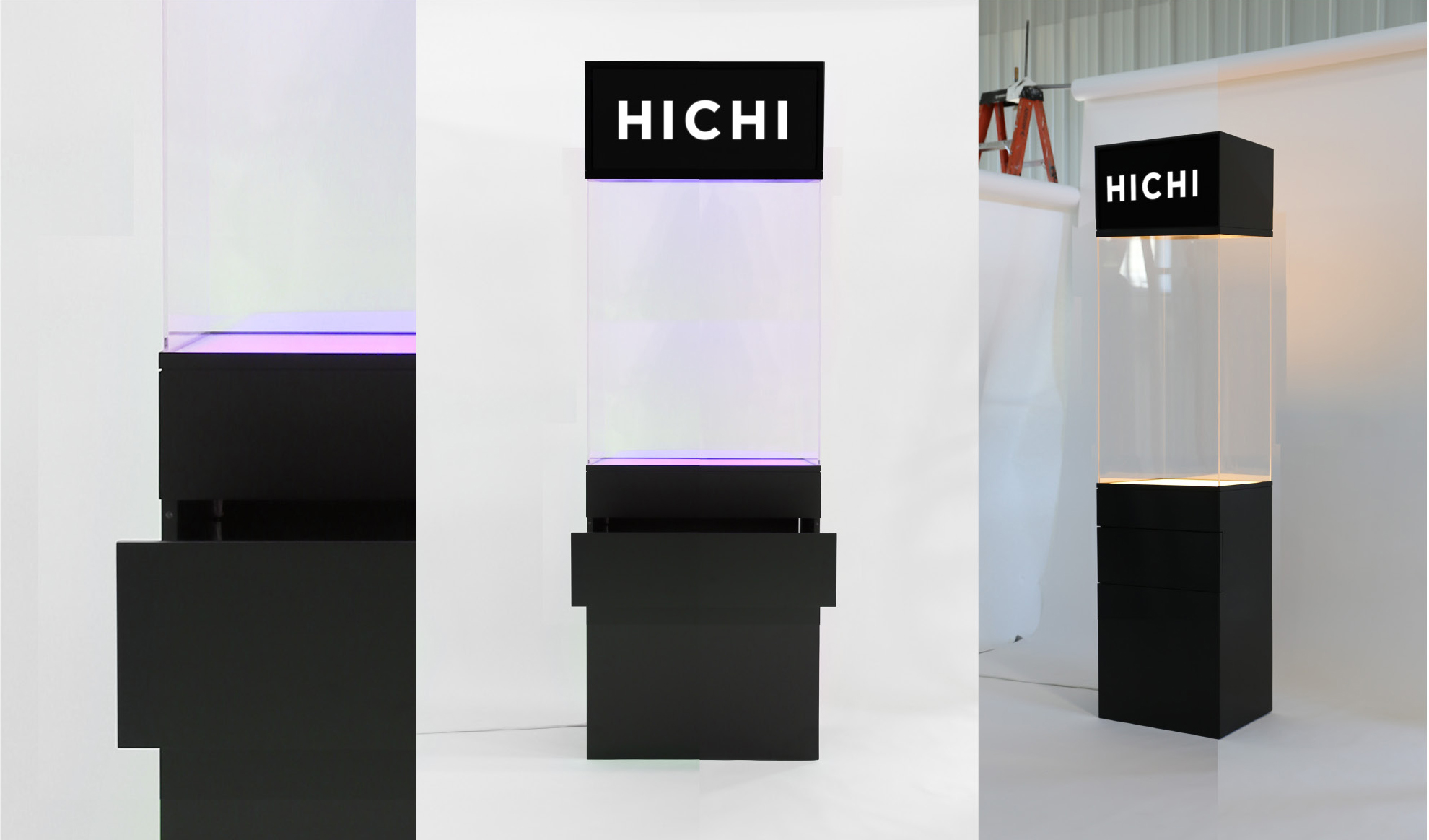
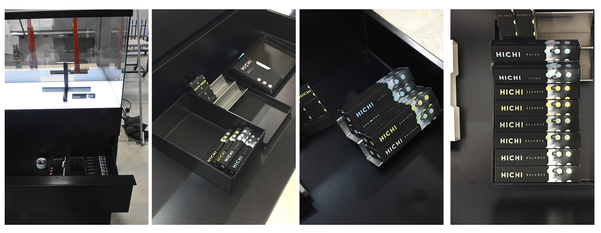
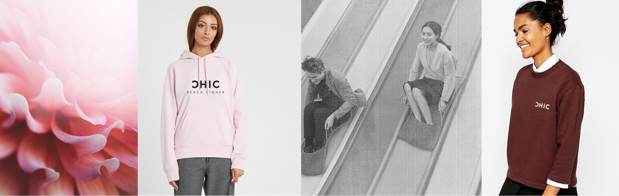
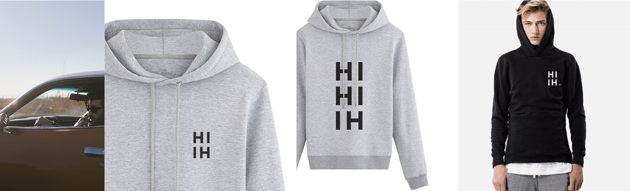
After an inititial proposal of a range of options and recommendations on ways to refresh and position the brand in the crowded cannabis marketplace, we were engaged to be the creative lead overseeing the development of the HICHI brand from look to communication, to product design, to packaging to the in-store shopper experience. Our team has been building the brand over the last year and half developing packaging design and solutions for a range of products, building the communications, and planning out the customer experience. Our client has the vision to build both the product and culture of HICHI as a new form of cannabis brand.
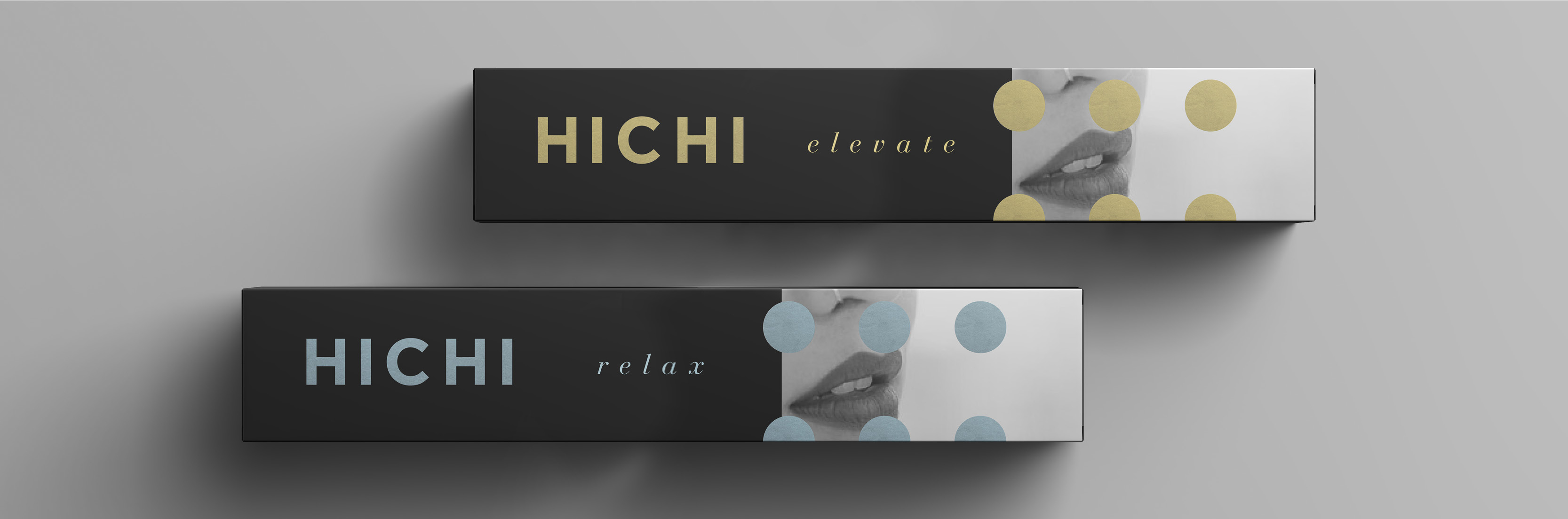
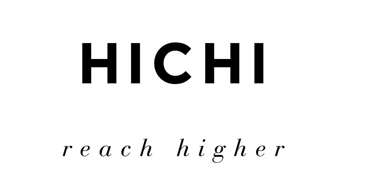
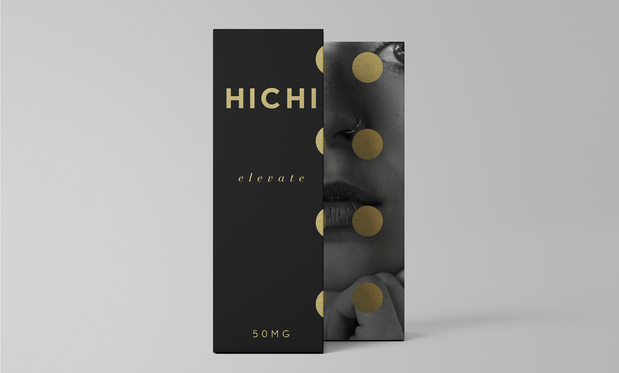
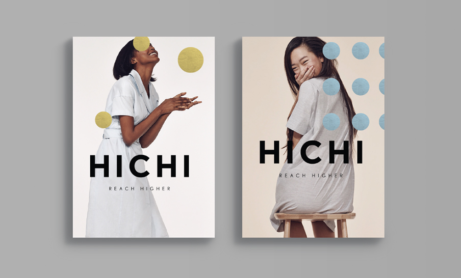
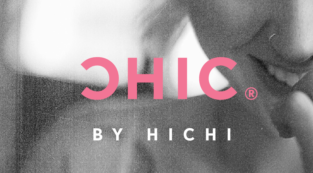
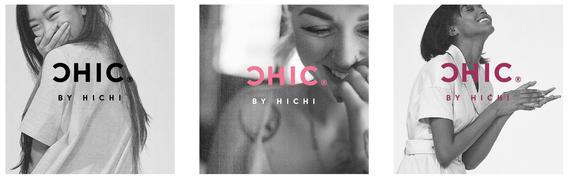
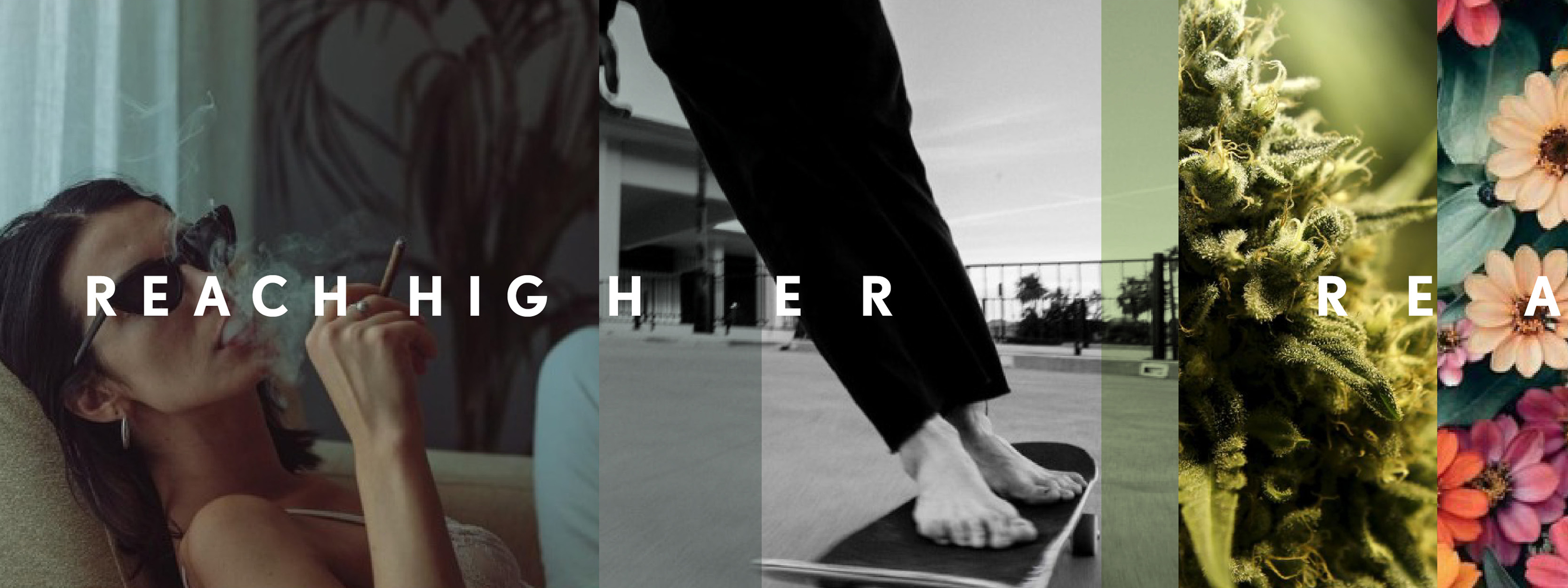
The HICHI brand is one of discreet luxury with a hint of glamour. We are interested in the power of a gesture,—the complexity of emotion and affect suggestive in a simple touch of the hand or crinkle of a lip. We want to explore the power of pleasure, as a form of reaching higher, doing better, being better. Cannabis is associated with the high, but the high is complex, personal, and can be a relaxation or a creative intensity and output.